
Team
TikTok Design, Global Community Product
Role
Product design intern
Collaborators
1 Product Manager
1 Data Analyst
1 Content Designer
2 iOS/ Android Engineers
1 Quality Assurance Engineer
Timeline
3 month
Context
Post Page Redesign was part of the bigger project Publisher Redesign. The big goal was to build a simple, efficient, and scalable content creation engine, lowering the barrier to creation and increasing the supply of content.
As the last step of creating, Post Page Redesign was the biggest project for creation side in Q3, 2025. With limitations in PM's workforce, our product design team took initiative to define problem space and push project launch.
My Role
I collaborated with a senior product designer and owned the project together.
In the research stage, I identified 27 design opportunities and delivered a thorough report of current in-app issues and competitor practices collaboratively, building a rich body of research insights and pushing project launch.
In the design stage, I explored solutions for the default mode of post page, iterating design with high quality and clarity.
In the development stage, I was in charge of the UI review, collaborating with engineers to ensure pixel-perfect implementation on both iOS and Android.
DESIGN SHOWCASE
Cleaner layouts, less cognitive load, more scalable

Photo

Video
CONTEXT
Publisher Revamp: more clear, effecient, and scalable
Lemon8 is a lifestyle community product targeting overseas users, with a core target audience of young women aged 18-30. It provides users with high-quality, informational content in the form of photo galleries and videos.
The goal of the publishing tool is to provide quick and easy editing capabilities → help/encourage users to create authentic and useful content → increase submission penetration and conversion rates → attract more users to consume/submit content.
While the current publishing tool is already feature-rich, simply adding features is no longer sufficient to increase submission rates, and it faces challenges in optimizing product experience, business development, and the content ecosystem. Therefore, this revamp aims to achieve the following goals:
Product & Business Goals
Improve overall posting conversion by 3%
Expand content supply by increasing overall submission penetration and user creation frequency
Support compatibility with various core content formats
User Experience Goals
Lower the creation barriers, reducing the steps and mental burden in the process
Improve core efficiency, creating a smoother journey
Establish a scalable framework to improve design and development efficiency
BACKGROUND
Post Page: the final step of publishing flow, a critical driver of conversion
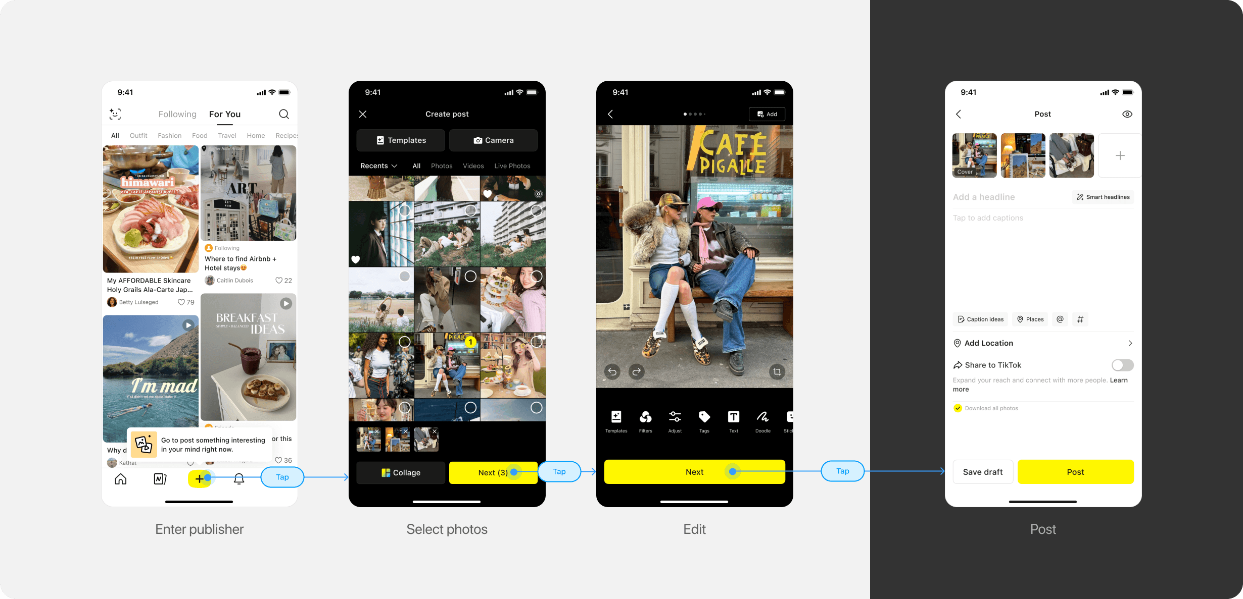
Journey of publishing a photo post
REDESIGN GOALS
Clarity
P0
Reduce visual noise with cleaner layouts and more consistent styles.
Efficiency
P1
Integrate repetitive or similar function entries to reduce cognitive load.
Scalability
P2
Build a scalable framework that allows new features in the future.
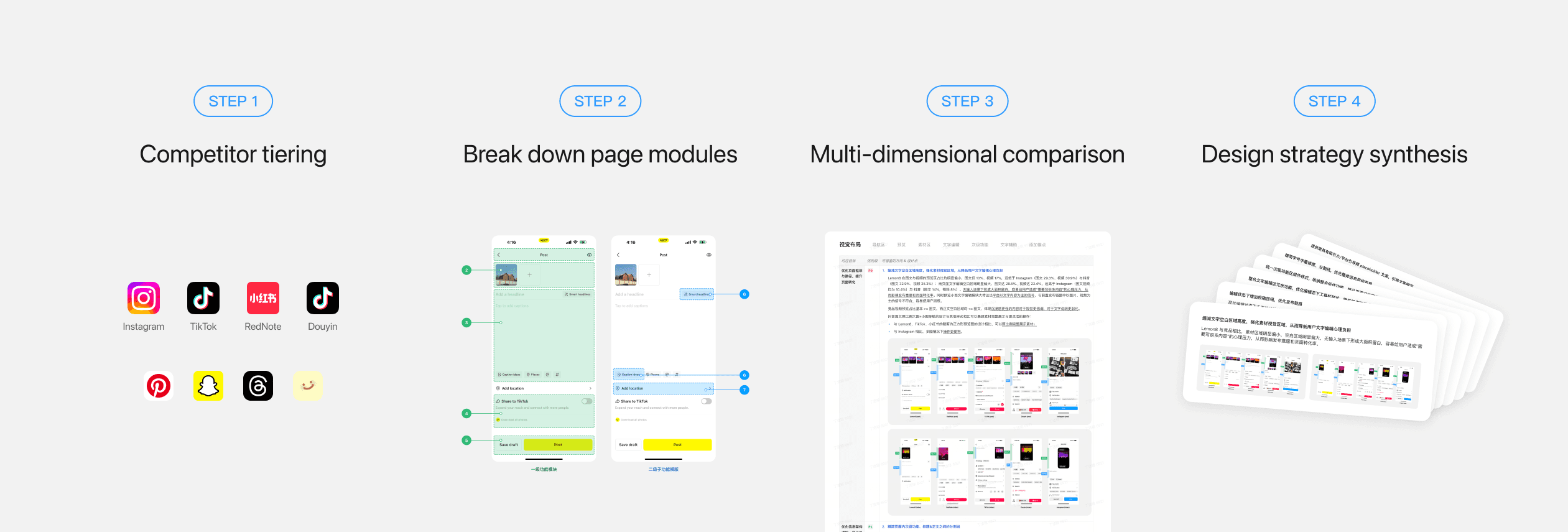
COMPETITIVE ANALYSIS
Learn from market best practices
DESIGN STRATEGY
01
Optimize layout to follow clear visual hierarchy
02
Streamline the publishing flow to boost efficiency
03
Consolidate entry points to reduce cognitive load
04
Reduce visual noise to ensure long-term scalability
KEY SOLUTION 1
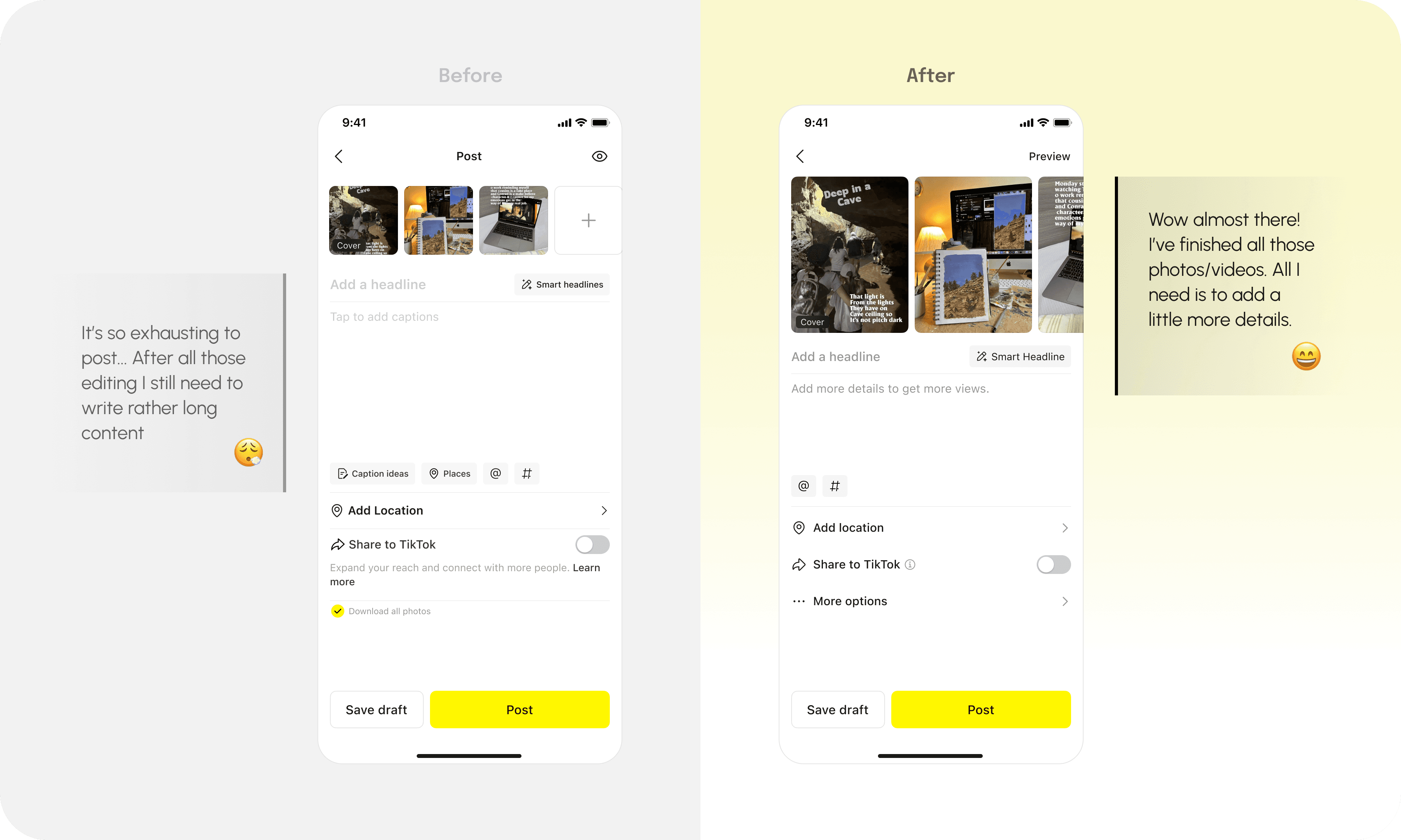
Reducing excessive white space to avoid text editing pressure
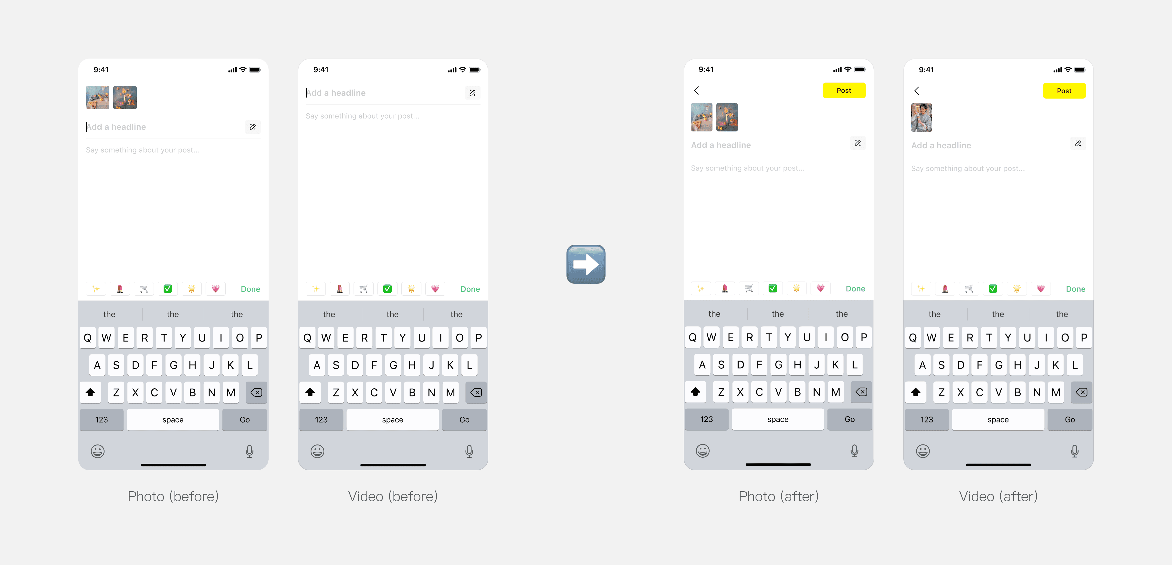
Looking at data, we found that users' primary action include viewing their photos or videos in the media area and adding topics in the captions. However, the media area is disproportionately small while the text editing section leaves excessive white space. In addition, the post settings have an overly heavy visual emphasis. Together, these issues create a visual hierarchy that fails to match user priorities.

The design was originally intended for encouraging high-quality creators and longer content texts, thus highlighting the text editing area. However, large areas of blank space can apply pressure on general creators that they "need to write a lot of content" to post on Lemon8, thereby affecting their willingness to publish and post conversion rate.
We reached consensus with PM to shift the role of post page from "complex content editing stage" to "the final step in perfecting content," highlighting the media area as primary where users have already finished editing and put text area as secondary.
KEY DECISION 2
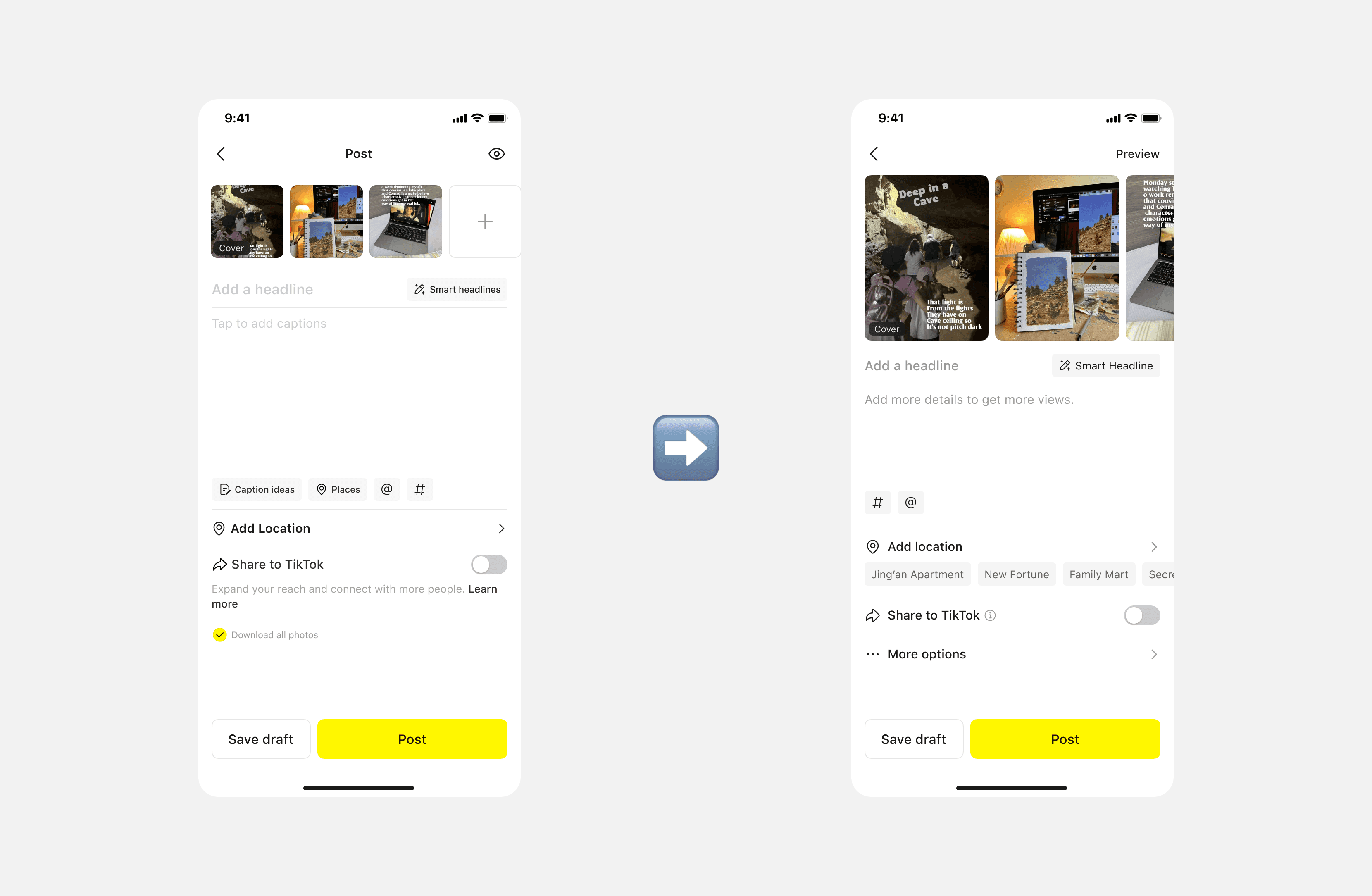
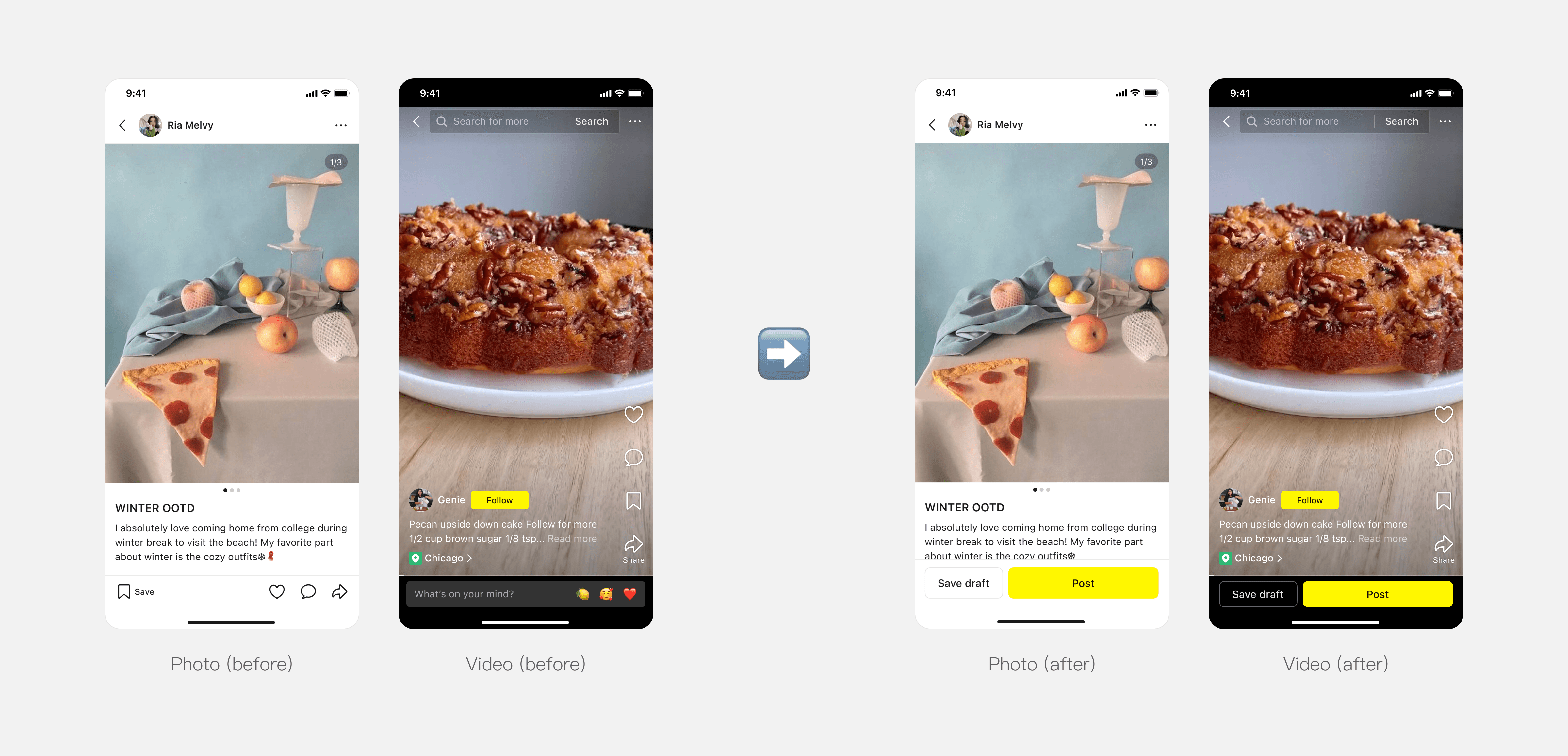
Streamline the publishing flow to boost efficiency
When users finished writing the captions, they must exit the editing mode and return to the post page to complete submission. This extra step breaks the workflow and creates unnecessary friction in the publishing process. Therefore, we added a post CTA in the editing mode, allowing more consistent workflow.
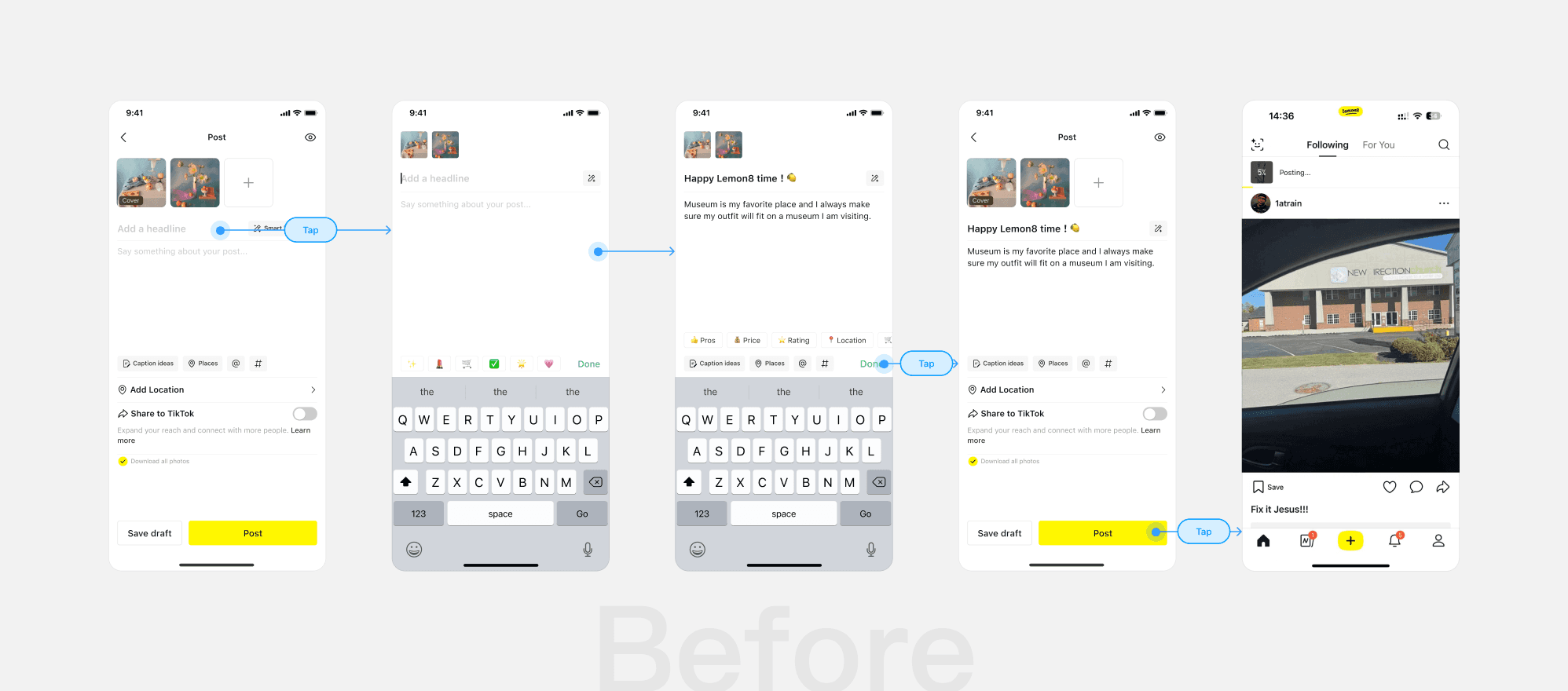
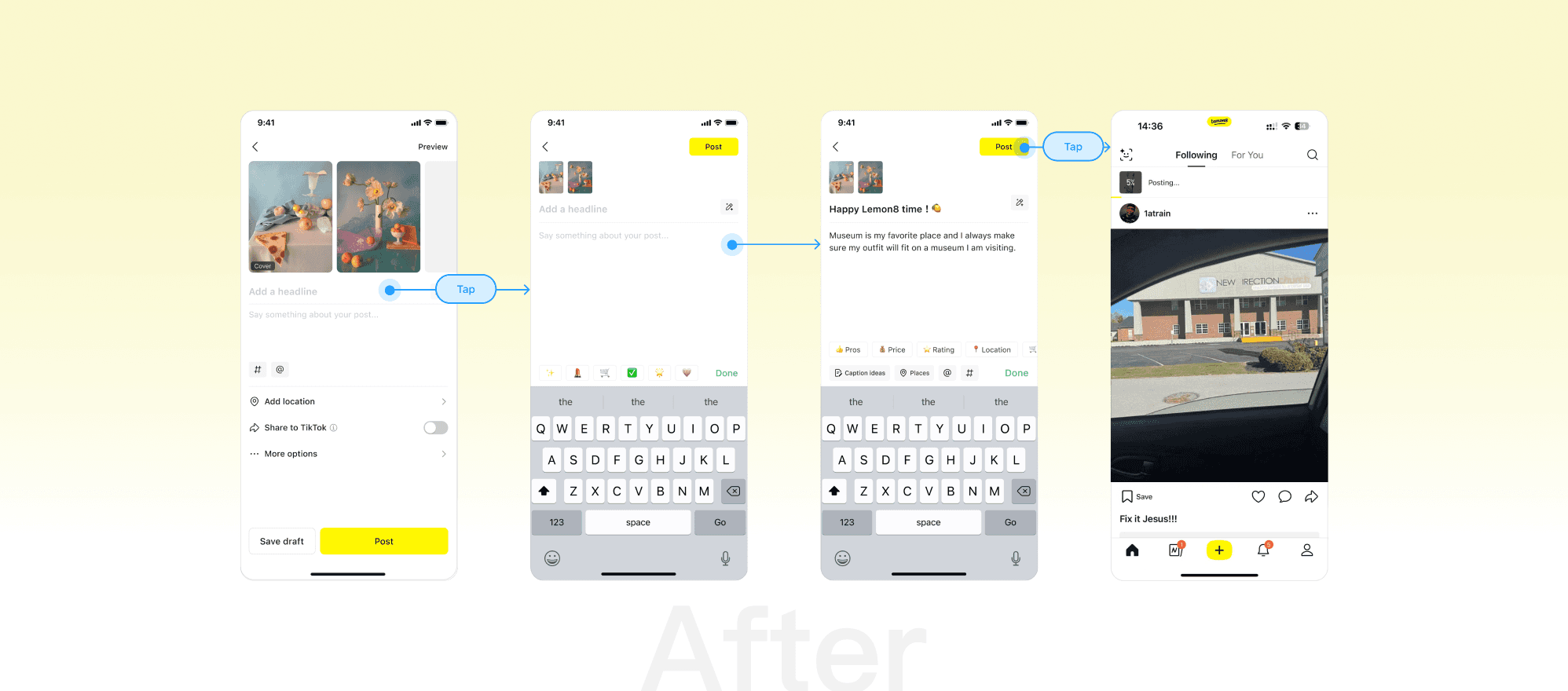
We also unified editing mode structure of video and photo posts by adding media preview in video's editing mode, ensuring a more consistent experience.
In future iterations, we also hope to add post CTAs in previews to make the posting experience more flexible.
KEY SOLUTION 3
Integrating text edit entries to avoid confusion
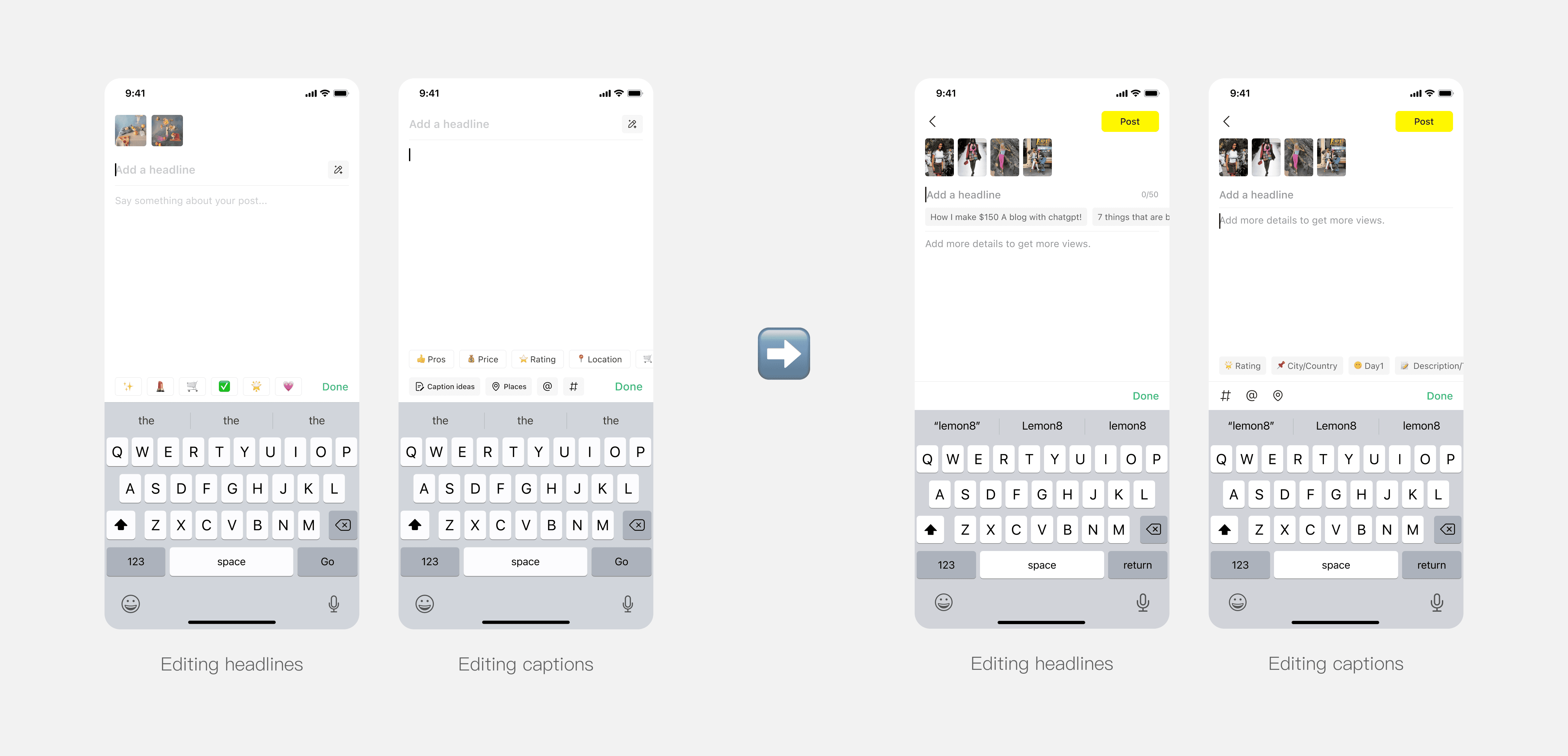
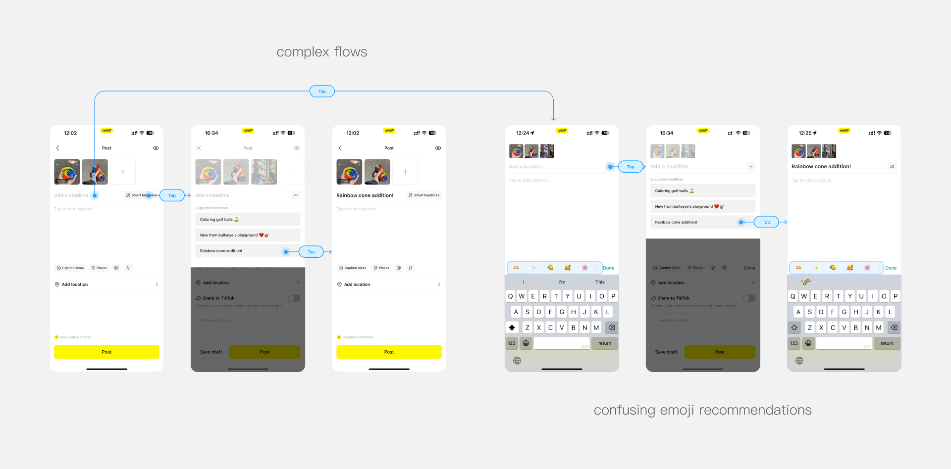
Lemon8's text editing functions have multiple entry points, resulting in a complex and less intuitive user experience.
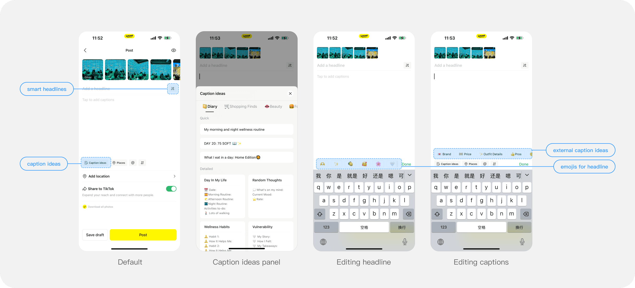
We decided to break down the challenge by focusing on headline editing and caption editing separately.
For headlines, the smart headlines were displayed in a separate panel, forcing users through repeated taps just to review or apply suggestions. At the same time, the emoji recommendations do not align with user intent and add visual clutter rather than meaningful guidance. Therefore, we removed the emoji labels and merged the modal suggestions into the main page for a cleaner, uninterrupted editing experience.
➡️

For captions, the caption ideas function has complex interaction flows, low usage and poor match with post contents. Therefore, we removed this function and displayed other caption editing functions in a cleaner way.
➡️
KEY SOLUTION 4
Unifying Components to reduce visual noise and ensure scalability
Competitors have much more post setting functions than Lemon8. They generally expose core/high-penetration functions and hide secondary/low-penetration functions to maintain page support complex functionality. Lemon8 has only three post setting functions, yet they are rather complex and inconsistent in styles, leaving no room for future functions.
Therefore, I redefined the component, addressing information hierarchy problems, unifying styles and ensuring scalability.
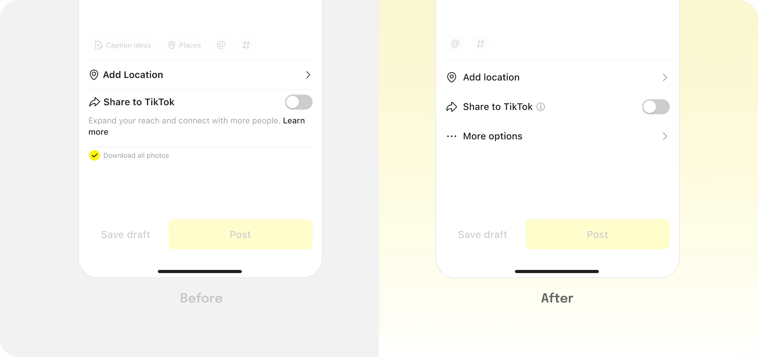
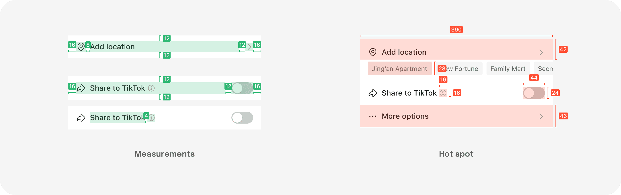

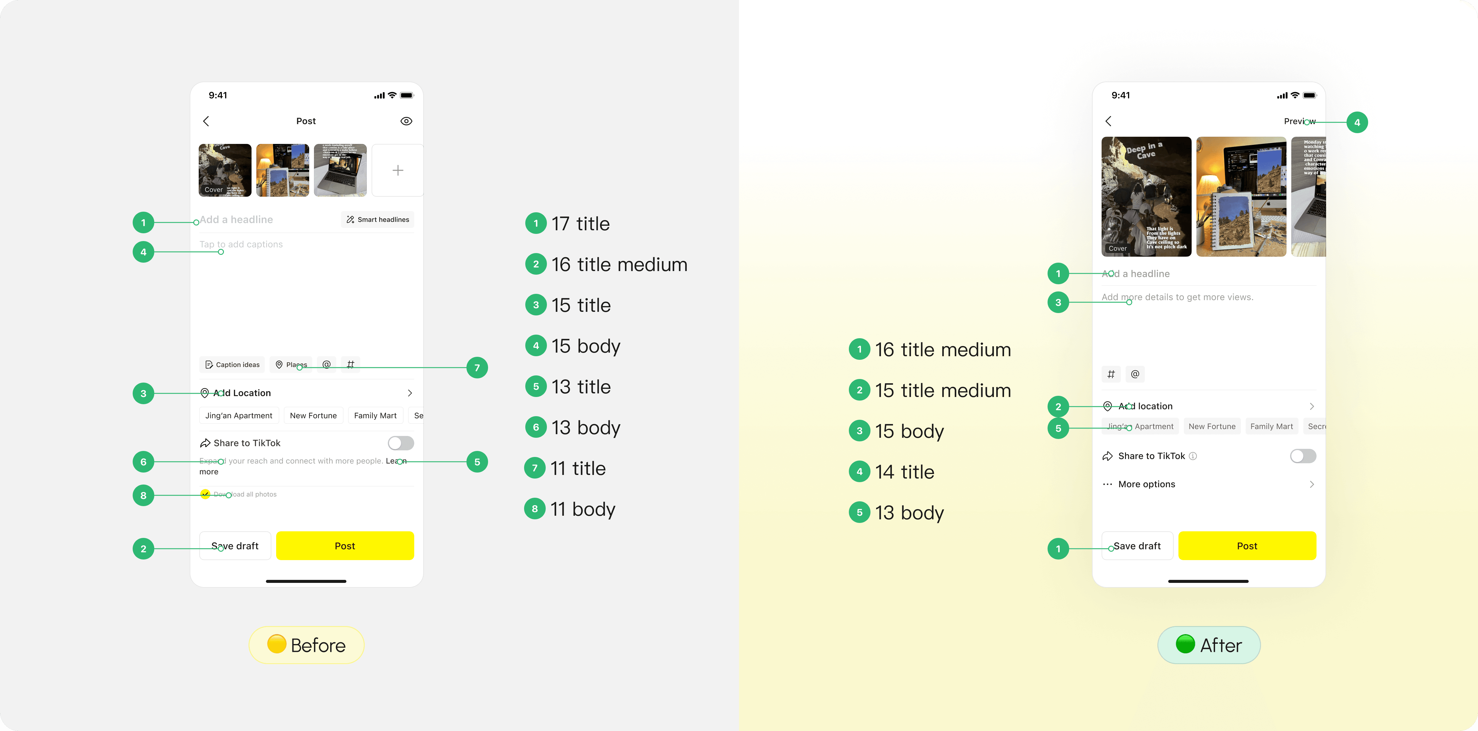
For the visual hierarchy as a whole, I simplified the font style hierarchy from 8 to 5, and reduced the use of divider to 2.
TAKEAWAY

Precision over comprehensiveness
Early on, I tried to capture everything in the competitive analysis: every UI detail, every competitor feature. But after discussions with the team, I've realized that comprehensive doesn't mean insightful. Real value comes from asking the right questions and focusing research around actual user needs and business goals, not checking boxes.
Navigating ambiguity through structured thinking
Working on consumer products means dealing with ambiguity—there's rarely one "right" answer. I've found that strong design decisions don't come from gut feelings alone. They come from breaking down the problem bit by bit and having a clear map of evidences and hypotheses.